
Heatmaps | How to Use and Best Practices


Heat-maps
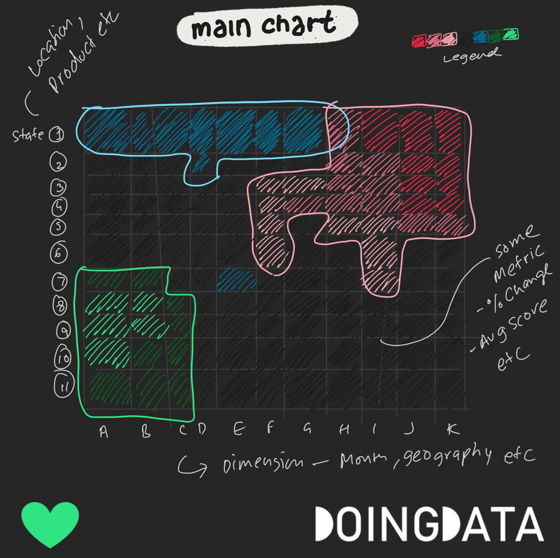
Generally, 2 dimensions and 1 measure are required.
1 dimension goes on X-Axis
other dimension goes on Y-axis
The measure goes on the color intensity
Basic Structure
The chart is used to reveal hotspots and patterns
Diverging color preferred over continuous
Measures used are mostly ratio instead of SUM
Both dimensions are cross-sectional, not hierarchical
Variations
Calendar Heatmap for daily and weekly pattern
Long term changes for slowly changing measures like global temperature
Geographic heatmaps to find geo-clusters
Layout based heatmaps in sports, webpage analytics, stadium attendance, street-level activities
Best Practices for Heatmap
A good diverging theme is important that stands out
Don’t use X-Y dimensions which do not intersect a lot
Ensure to have enough sample size for each cell to avoid extreme values based on a very small sample