Become My Student
Book Appointment
Blog
BI Consulting
Hello
My Project Work
You Can Do

Here is a description of your company. Proin ex id consectetur lobortis. Aliquam, velit vel faucibus dapibus, augue justo ullamcorper turpis, nec convallis metus nunc vel turpis.

Schedule
DoingData
DANP Diaries - Cohort 01 / Week 01
Aug 16

Aug 16 DANP Diaries - Cohort 01 / Week 01

Ashish Singh

We kicked off the first week of DANP. Excited and looking forward. Talked about the shape of data How MySQL, Tableau Prep, and Tableau Desktop fit together.

What is Tableau Hyper API for Python
Jun 13

Jun 13 What is Tableau Hyper API for Python

Sandip Sharma
data engineering

Understand what is Tableau’s new and powerful Hyper API and how it can automate your data extract workflows.

KPI Dashboard - Drilling Down into A KPI
May 16

May 16 KPI Dashboard - Drilling Down into A KPI

Ashish Singh
business intelligence

Comparing a KPI agaist period, products, and geographies. Benchmarking against the competition.

KPI Dashboard - Comparing and Benchmarking KPIs
May 16

May 16 KPI Dashboard - Comparing and Benchmarking KPIs

Ashish Singh
business intelligence

Comparing a KPI agaist period, products, and geographies. Benchmarking against the competition.

KPI Dashboard - What is a KPIs
May 16

May 16 KPI Dashboard - What is a KPIs

Ashish Singh
business intelligence

What are KPIs and how are they used to measure and monitor the performance of a system.

Heatmaps | How to Use and Best Practices
May 6

May 6 Heatmaps | How to Use and Best Practices

Ashish Singh
data visualization

How to use heatmaps, guidelines, and best practices.

Scatterplot | How to Use & Best Practices
May 6

May 6 Scatterplot | How to Use & Best Practices

Ashish Singh
data visualization

How to use scatterplot, guidelines, and best practices.

Trellis Chart | How to Use & Best Practices
May 6

May 6 Trellis Chart | How to Use & Best Practices

Ashish Singh
data visualization

How to use stack small multiples, guidelines, and best practices.

Stacked Bar Chart | How To Use & Best Practices
May 6

May 6 Stacked Bar Chart | How To Use & Best Practices

Ashish Singh
data visualization

How to use stack bar charts, guidelines, and best practices.

How to Create Jitter Plot (Strip Plot) in Tableau
May 27

May 27 How to Create Jitter Plot (Strip Plot) in Tableau

Ashish Singh
data visualization

What are jitter plots (strip plots) and how to make them in Tableau

A Guide to Tableau Desktop Certification
May 20

May 20 A Guide to Tableau Desktop Certification

Ashish Singh
data visualization

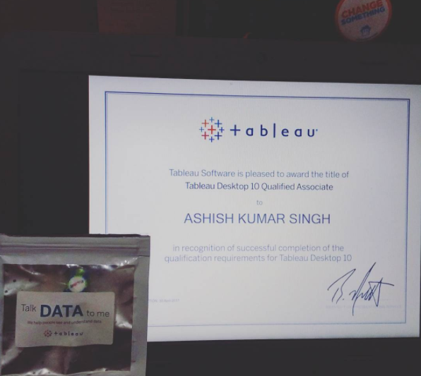
My personal experience of getting Tableau Desktop Qualified Associate certification and what you can learn from it

How to Create Sparklines in Tableau
Apr 4

Apr 4 How to Create Sparklines in Tableau

Ashish Singh
data visualization

Step by step guide on what are sparklines and how to create sparklines in tableau

How I Came to Choose One out of Sixty Two Data Visualizations
Apr 4

Apr 4 How I Came to Choose One out of Sixty Two Data Visualizations

Ashish Singh
data visualization

My personal scores for 62 geospatial #ironviz feeder entry visualisations.

How to Create an Arc Diagram in Tableau
Apr 3

Apr 3 How to Create an Arc Diagram in Tableau

Ashish Singh
data visualization

What is arc diagram and step by step tutorial on how to create in Acr Chart in Tableau!

Art vs Science : How I Learned Tableau
Mar 20

Mar 20 Art vs Science : How I Learned Tableau

Ashish Singh
data visualization, business intelligence

How I learned Tableau and the engineer vs the designer dilemma!

How to Create a Population Pyramid Chart in Tableau
Jan 25

Jan 25 How to Create a Population Pyramid Chart in Tableau

Ashish Singh
data visualization

Step by step tutorial on how to create Population Pyramid in Tableau and how it can be used in demographic and marketing analysis.

How to Create a Funnel Chart in Tableau
Jan 7

Jan 7 How to Create a Funnel Chart in Tableau

Ashish Singh
data visualization

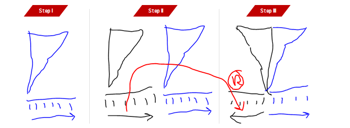
Step by step tutorial on how to create funnel chart in Tableau and when a funnel chart should be used.

How to Create a Donut Chart in Tableau
Jan 4

Jan 4 How to Create a Donut Chart in Tableau

Ashish Singh
data visualization

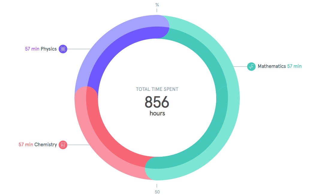
Learn how to create donut chart in Tableau and when a donut chart should be used (Video tutorial embedded)

How to Create A KPI Dashboard in Tableau
Dec 21

Dec 21 How to Create A KPI Dashboard in Tableau

Ashish Singh
data visualization, business intelligence

Step by step guide on how to create KPI Dashboard in Tableau

How to Install Tableau SDK for Python
Dec 18

Dec 18 How to Install Tableau SDK for Python

Ashish Singh
data engineering

Step by step tutorial on how to install Tableau SDK for Python.

Load More
Footer.png
DOINGDATA.PNG
 

DoingData’s mission is to inspire, encourage and help you become a data analyst 🚀

doingdata.org/youcando

DoingData © 2015-2019 All rights reserved. Terms of Service

Work together

I have done consulting work with people and clients across the globe over years. If you want to hire me for a project, let’s talk about it. Please fill the form below to start a conversation.

Let's talk

My Work »

BE MY STUDENT

I am constantly learning about one thing or another at any given point of time. You should too. It is never too late to start doing what you always wanted to do. Figure out what you want.

Start learning

You Can Do »

READ THE BLOG

Sit back, grab a coffee and enjoy reading the data blog.

Read Blog
 
 
Vision & Mission