
How to Create Jitter Plot (Strip Plot) in Tableau
I was recently influenced by one particular chart from Alberto Cairo's book The Truthful Art. The chart is a strip plot (a.k.a. jitter plot) and Alberto used it to clearly visualize Ideb Score (quality of education) of more than 19,000 schools on one single screen. Impressive!

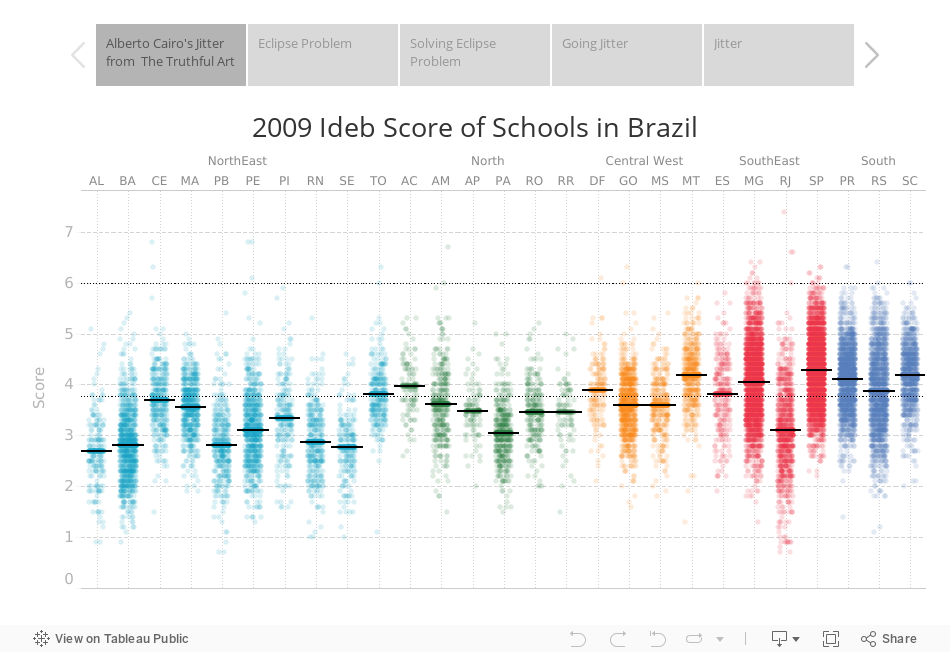
An equivalent of Alberto's jitter made using Tableau. Each dot represents a school. Credits for inspiration: The Truthful Art
It was not that I had never seen jitters before, but I have been ignorant enough to not to use those until I saw this chart. And I really got interested in if I can do this in Tableau. In this post you will learn about jitter plots, how to create them using Tableau and when they should be used.
Problem of Eclipse in Data Visualization
It is so frustrating when you create a plot and some marks on the overlap each other and you are not able to see the marks hidden underneath. It is like 'mark-eclipse'.
Think of this: We are trying to understand relationship between cylinders in a car and miles per galon of that car. We are using famous mpg data of 398 cars. After creating a scatterplot of 398 cars, we end up with something like this:

They do not look like 398 dots. Exactly! The reason is becuase there are a lot of cars with same cylinder and mph value and these cars get overlapped on the top of each other hiding from our view. But what is the point of visualizing data if we cant see it properly, so we gotta fix our visualization and make it look with proper indication that there are some cars hidden underneath.
Fortunately, color transparency and jitter are two powerful tools that can help us solving this problem. Unfortunately, though color transparency is available in Tableau, a readymade solution for jitter is not. First we are gonna see how we can use color transparency to make the chart better

Improving eclipsed chart using tools like transparency and referencing!
Chart I is the original one with marks-sclipse problem. In Chart II, I added a transparency of 15% to the color of marks and this gives us darker regions where cars are overlapping and lighter shades where cars are not overlapping or less overlapping. And Chart II looks better than Chart I in unhiding thos eclipsed cars data. We can do more by addiing a boxplot around transparent dots to include summary statistics like minimum, maximum, median and inter-quartile-range as we have done in Chart III and Chart III does a much better job in explaining the relationship between cylinders and mpg as compared to Chart I.
But can we do better?
So, What is Jitter Effect
Adding a small random noise in the data so that overlapping marks seperate from each other a little bit is called jittering the data. Look at the demonstarion of jittering effect:

How to Create Jitter Plot in Tableau
So you see the idea behind creating jitter is adding some random noise in the data. But the problem is that we do not have an inbult RANDOM function in Tableau. Actually there is but it is hidden and doesn't show up in the calculation box. I simulate lots of random data for examples to be used in my training class, and finding this hidden RANDOM() function in Tableau was like woaaahaaa! moment for me. A huge thanks to Zen Master Mark Jackson for that.
So we are gonna use RANDOM() function to create jitter plot in Tableau. We are going to use mpg data in this example (enclosed at the bottom of this post)
Step I: Create a new field called Random Noise:
RANDOM()This will create a series of random numbers from .01 to .99 for each car.
Step II: Now we can add this random noise to number of cylinders in the car so that number of cylinders randomly changes for example: a car with 2 cylinder might now show up 2.34 cylinders.
Create a new field called Cylinders Jittered:
[Cylinders] + [Random Noise]/3I have divided random noise by 3 because width of noise is very wide (.01 to .99) as compared to numbers of cylinders (2 to 7). With this division, the range of noise becomes narrow (0 to 0.33) and suitable to be added with cylinders.
Step III:
- Drag
Cylinders JitteredonColumnsshelf - Right click on it and comvert it into
Dimension - Drag
mpgonrowsshelf - Drag
IDonDetailscard - Set color
Opacityto 50% - Adjust the
Sizeof marks a little bit
And there you go:


Note: We can improve jittering further. If you notice, we are 'adding' all the random noise, so all the jittering is happening to the right side of the original data points. We add some points and substract some points to get the equal distribution of jittering around both sides of the original cylinders. To do that, change the calculation of Cylinders Jittered as follows
[Cylinders] +
(IF [Random Noise] < 0.5 THEN [Random Noise] ELSE [Random Noise] - 1 END)/3
Tableau Workbook
Enjoy,
Ashish