How to Create a Donut Chart in Tableau
What is Donut Chart
Technically speaking, donut chart is a pie chart with a hole in the middle. And you can use that hole to put a nice label that usually comes up ugly in the pie chart.
How to Create a Donut Chart in Tableau
Here is a short version of how to create a donut chart:
Create a pie chart
Overlay a blank hole in the middle
Add label on the blank hole
Note: We are using Superstore data-set for this example
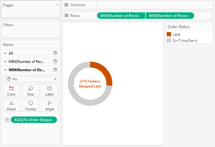
Step 1: In this example we are going to show on donut what percent of orders are being shipped late. So the pie chart we will create will have two slices: % Order Shipped Late, % Orders Shipped On-Time/Early. Create 2 calculated fields named Order Status and Order Count:
IF [Days to Ship Actual] > [Days to Ship Scheduled] THEN 'Late' ELSE 'On-Time/Early' END

COUNTD([Order ID])
Drag Order Status on Color
Drag Order Count on Size
Select Pie from Marks chart type dropdown
Right click on Order Count in the mark-shelf > Quick Table Calcuation > Percent of Total > Compute Using > Order Status
Also set 'Late' color to some dark color and 'On-Time/Early' to light grey

At this point, your chart should look like this
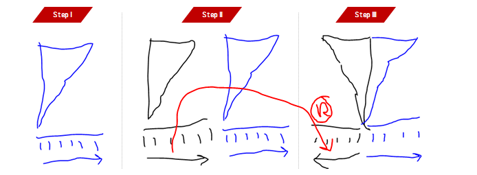
Step 2: To create a blank hole in the middle, we are going to use dual-axis. It's simple
Drag 'Number of Records' measure on Rows shelf two times
Change the aggregation of both 'Number of Records' from SUM to MIN
For the second MIN(Number of Records), remove everything from marks shelf and reduce the size
Change the color of second MIN(Number of Records) circle to white
Right click on the second MIN(Number of Records) and select dual axis
A little bit of formatting and cleaning and this is it. Please be careful while you reduce the size of second circle. Make sure you are only reducing the size of second circle other you will not that effect of 'doughnut' in your chart if you reduce size of both circle at the same time.
To clean the chart, synchronise the dual axis, remove axis, zero lines etc.

After step 2, your chart should look like this
Step 3: This step really isn't much. Just create a calculated field % Order Shipped Late as follows:
![COUNTD (IF [Order Status] = 'Late' THEN [Order ID] END) / COUNTD([Order ID])](https://images.squarespace-cdn.com/content/v1/56fd706140261df95349d4bd/1483499104866-H8X8NVLZ77KD1A85C49Q/image-asset.png)
COUNTD (IF [Order Status] = 'Late' THEN [Order ID] END) / COUNTD([Order ID])
And drag this calculated field on the label for small circle, which is second MIN(Number of Records). Do a little bit formatting further and you should see your final chart like this:
Donut Chart in Tableau!
Here is a step by step gif on how to make donut chart just in case if you missed on any step

Donut Chart Best Practices
Do NOT use donut charts as often as you think you should. Yeah! You read that right. They are zazzy, but not that informative. use a bullet chart instead. Why they are not recommended in data visualisation community is for these couple of reasons
They conceal more than what they reveal
They make comparison difficult
Aren't much readable without support of labels
Adding labels in donuts isn't a neat exercise eaither
When more than two colors added on slices, they get really ugly and difficult
Donut Chart is a Pie Chart after all ;)
Zen Master Steve Wexler suggests to eat cake instead of a doughnut chart and I couldn't agree with him more.
One may be very tempted to create donuts to show contribution of a particular category into 100%

Each donut chart shows contribution of category into 100% for a particular region
Looks pretty cool? Sure it does! But the chart actually hides and/or makes many comparisons to read very difficult like:
In West, is Office Supplies bigger than Technology sales?
Is Office Supplies Bigger in East than West?
How large is Furniture as compared to Technology in Central?
And so on... A bar does the justice better. Don't believe me, make one for yourself and try to answer questions asked above.
But now we are left with the question, when to use donut charts. I know my answer,'Don't use them' will disappoint you a lot. After all donuts and pies are one of most used charts in the print (more on that story some other time). Okay, I will tell you when and to use donut chart but also use them with extreme care:
Note: Use only 1 donut at a time, do not use side-by-side donut like in the example above. Because intra-donut comparison is easy, but inter-donut comparison is not
To show an achievement % in a scenario when achievement can never go beyond 100%
Like in the first example, no matter how hard Superstore tries, it can never exceed 100% orders shipped on time. Donut is OK to be used in such KPIs.
Percent of orders shipped Late
Percent of Calls finished within SLA
Percent of Reviews 4+ ratings
When dealing with KPIs like Sales Target Achievement which can go beyond 100% (when sales is higher than target) donut is not a a good idea.
Accompany donut chart with a line trend chart to show changes over time
Usually after looking at a donut like that: Orders Shipped Late, the first thought comes to mind is are we improving over the time? For such scenarios it is awesome to accompany donut with a line chart for those further comparisons
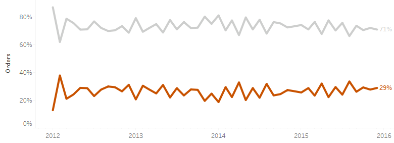
Enclosing this line chart along a donut can add a lot meaning.
I would love to hear from you in the comment sections, how are you going to use donut chart and what is the situation which led you to choose a donut chart over other options available.