
How to Create a Population Pyramid Chart in Tableau
What is Population Pyramid Chart
Population pyramid is used to visualize demographic data. Data is divided into age groups and gender and then one gender is shown on the left side of chart and the right side plots the other gender while age groups are plotted along y-axis in sorted order.
The chart is popularly known as population pyramid because chart looks in the shape of a pyramid because of nature of demographic (though data-sets other than population also can be visualized using pyramids)
Most amazing thing about population pyramid charts is the study of changes over time when the chart is animated.
Population pyramids are very effective to study demographic patterns and comparisons in the data. Sometimes pyramids are animated along the time to see dynamics of the demographic composition over the period of time.
Two or more pyramids can be compared side by side either for same country in multiple years or for multiple countries in the same year.

You can compare two countries (or more) demographics side by side
How To Create Population Pyramid Chart in Tableau
We will use the data from World Bank for population of countries Japan, China and India. The data has population by age and gender from 2001-2050. You can either download from World Bank or a copy of the same from the link below to follow along
Step 1 Reshape the Data: Data that we downloaded from the World Bank is in the wide format.

Each year has its own column
However, we want the data in the tall format so that we have a column for year and and another column for population. Something like this:

Fortunately, this kind of reshaping is easily possible in Tableau using Pivot functionality while importing data from a CSV or Excel.
[Note: When you are using SQL to import data for your chart in Tableau, please make sure that your SQL generates data in the tall format to produce the pyramid]
Connect to CSV using Text File connection and choose option Field Names in First Row by right clicking on the filename in the connection windows. Next is to select all the columns with years as header. To do so, simply press Shift and select first year column 2001 and then while keep pressing shift, scroll till last, and select the last column 2050. After the selection is done, right click and select pivot.
Rename Pivot Field Names to Years and Pivot Field Values to Population. After you are done with data prep, your connection screen should look like this:

Step 2 Prepare the Visualization: Once you're done with data reshaping, the remaining part isn't much that just a few drags and drops.
Create two calculated fields Female Population and Male Population as follows
IF [Gender] = 'Female' THEN [Population] END

IF [Gender] = 'Male' THEN [Population] END
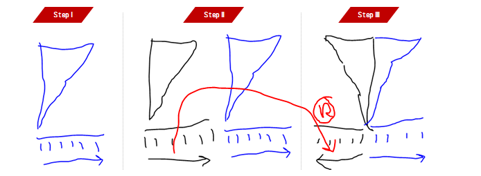
Drag Age Group the Rows self and sort it in decending order so that small age groups are at the bottom and order age groups are at the top

Next, drag Male Population on the Columns shelf, and then next to it, drag Female Population as well to the Columns shelf. And then 'reverse' axis for the Male Population by right clicking on Axis and ticking Reversed option.
And then from the marks shelf, select different colors for Male Population and Female Population. Here is the configuration after this step:

Step 3 Filter the Data: Till here? Good! But there are a couple of problems with this viz
- It is showing data summed up for both countries, India + China + Japan
- It is showing data for all the years from 2001-2050
- Axis for male and female population are not synched on the same scale
Okay, let's solve this problem. Drag Country Name on Filter and select India and China. Also, drag Country Name to the Columns shelf.
Drag Years to the page shelf to filter the year and also create an animation effect over the period of time.
The only problem remaining is that male and female population axis are not in the sync, to solve that problem, we will manually have to set the a maximum value on both of axis. To see the maximum population for any combination, describe the Population field.

It seems that length of bar will never go beyond ~69 Million mark.
Now manually fix the axis for both measures, Male Population as well Female Population to 71 Million, a little higher to be on the safe side. Please note, both axis should be fixed equal and should be more than the maximum possible population that might come in the chart otherwise bars with overshoot the axis.

Do the same for Female Population axis as well. With a little bit of cleanup and formatting, your chart is ready to be animated. Here is what the final result looks like:
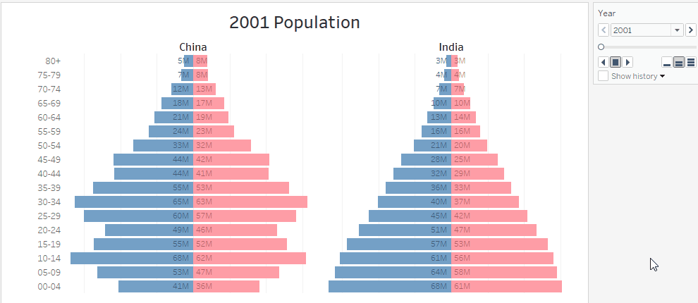
And you can see ripples showing demographic changes in both of the countries.
Application of Population Pyramid in Marketing Data
Now that's gonna interest you, yeah? I know :D Now think about this. Replace Age Groups with Sales Value Groups like: {$0-100, $100-200, $200-300, $300-400, $400-$500, $500+} Also, replace gender with Market Segment or two product categories that you want to compare, and then finally change population with number of customers. You marketing pyramid is ready. Like this:

Try to make one using Superstore data-set. And if you face any problem, please write back, we will try to create it together.
Till then, your friend in data visualization,
Ashish Singh @ashishyoungy