
How to Create Sparklines in Tableau
After being invented by Edward Tufte in 1983, sparklines gradually became a popular choice to represent time-series data after Microsoft Excel introduced sparklines in 2010. I love sparklines. They are compact, clean, easy to understand and perfect for dashboards.
What is Sparkline
A sparkline is a compact trend line chart without axis that fits in a small area and shows values over time.
So the key here is that sparklines show trends that means that they visualize time-series data, sparklines are line charts, they are without axis which means they do not start at zero, and they are compact which means that they are intended to fit in a small area and are mostly used for indicative purpose of the trend and changes over the period of time. Like all other charts, sparklines have their own advantages and disadvanteges, and are suitable for some visualizations more than others. We will discuss about properties and best usage of sparklines in the end section of this article.
How to Create Sparklines in Tableau
We are going to use Tableau Superstore data for representation. Creating trends over time is fairly easy with just a few drags and drops. If we play a bit with trend charts.
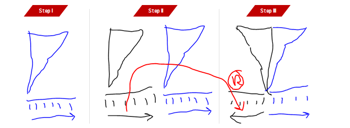
Step 1: Creating Sparkline
- Drag
Order DatetoColumns - Right Click on Order Date
Pilland selectMonth(Month Year) - Drag
SalestoRows - Right click on
Sales Axisand selectEdit Axis - Uncheck
Include Zero - Select
Independent axis rows for each row or columnand clickOK - Drag
SegmentonRows - Hide
HeaderforSales AxisandMonth of Order Date Axis
Step 2: Formatting Sparkline
- Resize and make sparklines compact
- Reduce the thickness of the sparkline
- Add tool-tips
- Add low and high data-points in red and green using table calculation and dual-axis
- Remove borders, zero lines, grid lines
There you go:

When to Use Sparklines
You just visualized more than 150 marks (3 segments x 48 months) in a tiny canvas space clearly and user-friendly manner. See, why sparklines are popular? But it does not make them a substitute of trend charts, in fact sparklines can be combined with trend charts to enhence the trend visualization even better.

An example of sparkline used to enhence the interactivity of the trend chart
But also, sparklines violate the most fundamental rule of data visualization : They do not start at zero. So use them cautiously. As there is no equal axis (each exis starts at a different scale then another sparkline) you cannot directly compare one sparkline with another, but you can see seasonal patterns among different sparklines and do the comparisions.
Stock markets, size of economy, business performance and KPI dashboards are perect places to make the best use of Sparklines.

Due to compactness of sparklines, they are great ways to show trends on a mobile UI.

Sparklines on a Mobile KPI Dashboard
Hope you enjoyed creating sparklines. Share below in comments how you used them in your own visualization. Enjoy!
Your friend, Ashish Singh