
How to Create a Funnel Chart in Tableau
What is Funnel Chart
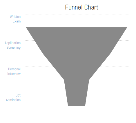
Funnel charts use used to visualise multi-stage processes where some subjects are part of the process. And these subjects progress through process, they keep getting eliminated in each stage and only a few survive till the end. Thus, in a funnel process, each stage has a 'survival rate'.
Imagine the application process for college admission. There are some students (subjects) apply for college and college has a standard admission process with three stages
- Written examination
- Application screening
- Personal interview
Only those who pass in written exam go to second stage application screening, and those who pass screening will be eligible for personal interview stage. Finally those who pass personal interview, get admission in the college. This is typical example of a funnel process.

How to Create a Funnel Chart in Tableau
We will use the above used admission example to create a funnel chart.
| Stage | Applications |
|---|---|
| Written Exam | 12 |
| Application Screening | 8 |
| Personal Interview | 3 |
| Got Admission | 2 |
Before we create the chart, let's think about it for a moment. We don't have an inbuilt funnel chart in the Tableau. But we can create one with a little workaround trick. The workaround is to create two vertical area charts side by side and then 'reverse' axis for the area chart on the left which will create an illusion for a funnel chart.

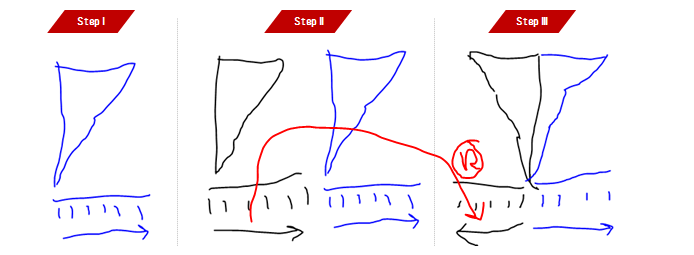
Step I: Drag stages to rows and applications to columns. From the marks shelf, select chart type area instead of automatic. Also manually sort stages in the order they happen.

After this stage you view should look like this:

Step II and III: Drag applications one more time on columns to create side by side two area charts. Next step is to reverse axis of the chart on the left. To reverse axis, right click on the axis and choose option 'edit axis' and check 'reversed' option and click OK.

Finally to clean the chart, remove gridlines, hide axis header, column borders and adjust height and width. Make sure to set transparency of color to 100% and there is your funnel chart
Funnel Charts Best Practices
Funnel charts are awesome and are perfect to show
- Customer acquisition funnel (digital marketing)
- Survival processes (competition, admission, sports, job)
- Sales funnel (Salesforce)
- Napoleon March (isn't that a funnel chart?)
I once did a funnel chart using bars instead of areas, and then to make situation worst, I color coded bars based on survival rate and then finally created a cross-section view for comparison. Chart because difficult to read, color stole a lot of attention from real information and we finally removed that chart.
Learn from my mistakes, please don't do what I did with funnels in the above example.
Also, funnels make it difficult to add labels in a symmetric nice place. Try to create a separate text chart and place it next to funnel (in a dashboard) with proper alignment to show key figures for the funnel.

I hope you enjoyed the tutorial and were able to recreate the chart using instructions. I'd love to hear from you how are you going to use funnel in your analysis.


