
How to Create an Arc Diagram in Tableau
What is Arc Diagram
First of all, like others, arc diagrams are not plain charts, they are graphs. That means they are used to visualize data in an inter-connected network, for example: characters in a novel or play where all the characters[^1] are linked to each other, grouped together in some way - socially or characteristically, and they engage with each other - act together in the same scene.
Now on to a more formal definition:
An arc diagram is a type of vertices-edges graph. In the arc diagram, all vertices are placed along a straight line and then edges are connected using arcs based on some relation between them.
This is what an arc diagram looks like:

Here is an excellent example arc diagrams used effectively to visualize simple continuous data. In this example, there no nodes and vertices like a graph, but each arc is the trajectory of the life-span of each individual person who died in a gun attack in USA during 2012 and 2013.
Each vertice starts at the age zero and ends at the projected age of the person had he not died in the gun violence (they have used a statistical technique to calculate projected age).
Types of Arc Diagram
Mostly, there are two kind of arc diagrams that exist - continuous node arc diagrams and discrete node arc diagrams. Let's understand each of those by example.
Arc Diagram with Continuous Nodes
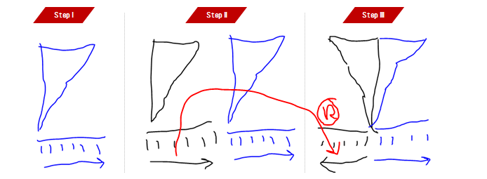
Consider a player throwing a ball at the distance from an starting point.
Throw 1: Distance 20 Mts
The throw can be visualized using an arc diagram.

Throw 2: Distance 30 Mts
This is how throw 2 will look when layered on the top of throw 1

Great! So the point here to be considered is that in continuous nodes arc diagram, nodes are not the subjects (throws) but they magnitude of subjects (distance). And for each subject, there needs to be drawn a separate arc (two arcs for two throws, 10 lines for 10 throws). Thus, nodes of the arcs end up being on a continuous scale number line, hence the I named them Arc Diagram with Continuous Nodes and location of nodes is predefined by the magnitude and cannot be changed.
Arc Diagram with Discrete Nodes
Now consider trade between countries.
Trade 1: Countries B & A are doing a mutual trade of $100 millions.
The trade can be visualized using an arc diagram.

Trade 2: Countries B & C are doing a mutual trade of $200 millions.
This is how trade 2 will look when layered on the top of trade 1

Again, now if you notice, there are a few difference here. Nodes are discrete (name of country) and the distance between two subsequent nodes is always the same. And also, the magnitude (trade amount) is denoted using width of the arc (higher the trade amount, wider the arc). In addition to that, also technically order of the nodes doesn't matter in the chart (chart would still display correct values if countries were ordered as C, B, A) though, the order might be important to make the chart more effective (more on this later).
How to Create Arc Diagram in Tableau (Continuous Nodes)
In our example, we are going to use this (imaginary) data:

10 people who were killed by gun, could have lived more if were not killed
And our task is to create a diagram like this:

Where orange trajectory is the age that person lived and the gray is the age that person could have lived up to if the person had not been killed.
Step: 1: Prepare the Data
Replicate the data-set 180 times to create a smooth curve. So in our new data, we will have 10 person 180 times = 1800 rows*. The newly created data will look like this:
Step: 2: Create Calculated Fields
Create calculated field x
((COS([Point] * PI() / 180)) + 1 ) * [Life Expectency] / 2Create calculated field y
(((SIN([Point] * PI() / 180)) * [Life Expectency] / 2) * [Died At]) / {MAX([Died At])}Create calculated field Status
[x] <= [Died At]Step: 3: Configure the Chart
- Drag
xtoColumnsShelf - Right Click on
pill xand convert it todimension - Drag
ytoRowsShelf - Right Click on
pill yand convert it todimension - Convert
Marks typefrom Automatic toLine - Drag
Person IDtoDetail - Drag
PointtoPath - Right Click on
Point pilland convert it todimension - Drag
StatustoColor - Do the final formatting and add tool-tips as appropriate
And there you go!
Hope you enjoyed reading the post and creating you viz. I will post how to create discrete nodes arc diagrams in some future post.
Your friend, Ashish Singh